
The Design Gap Between Claude Web and Claude Code Is Real — But Fixable
Same model, same prompt, three environments. The difference is a single plugin.

My wife asked Claude to design her a website. When I saw the result, I was a little embarrassed — it was noticeably more polished than what I'd been getting from Claude Code.
So I did what any reasonable person would do: I asked Claude Code what it thought. It agreed. The web version was producing better design work.
I decided to test this properly. Same prompt, three environments:
Claude web/mobile — which has Anthropic's frontend-design skill baked in
Claude Code raw — no plugins, no special instructions
Claude Code + the frontend-design plugin — Anthropic's official plugin, installed in about thirty seconds
The prompt was specific: build a landing page for a newsletter called Bare Metal Digest. Dark background, industrial terminal aesthetic, monospace typography, CRT effects. Hero, feature grid, email signup.
What I got
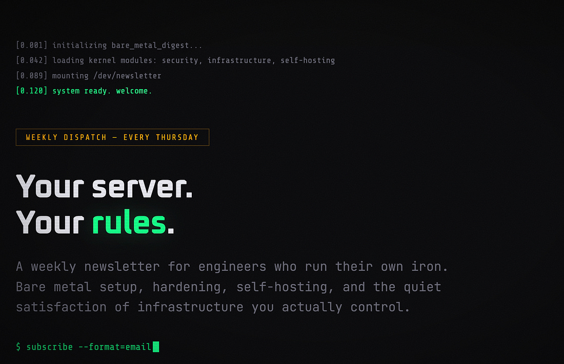
Claude Code without the plugin gave me a perfectly competent page. System monospace font stack, green-on-black, centre-aligned hero, clean grid. It even added a sample issue preview section — more content thinking than design thinking. But it looked like exactly what you'd expect an AI to produce for "terminal aesthetic website." Safe choices, predictably executed.
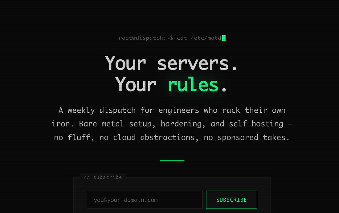
Claude web went further. Three intentional Google Fonts (Oxanium, JetBrains Mono, Share Tech Mono). A boot sequence animation with staggered reveal delays. Noise texture, vignette overlay, subtle scanlines. Layered glow effects on the green accent. It felt considered.
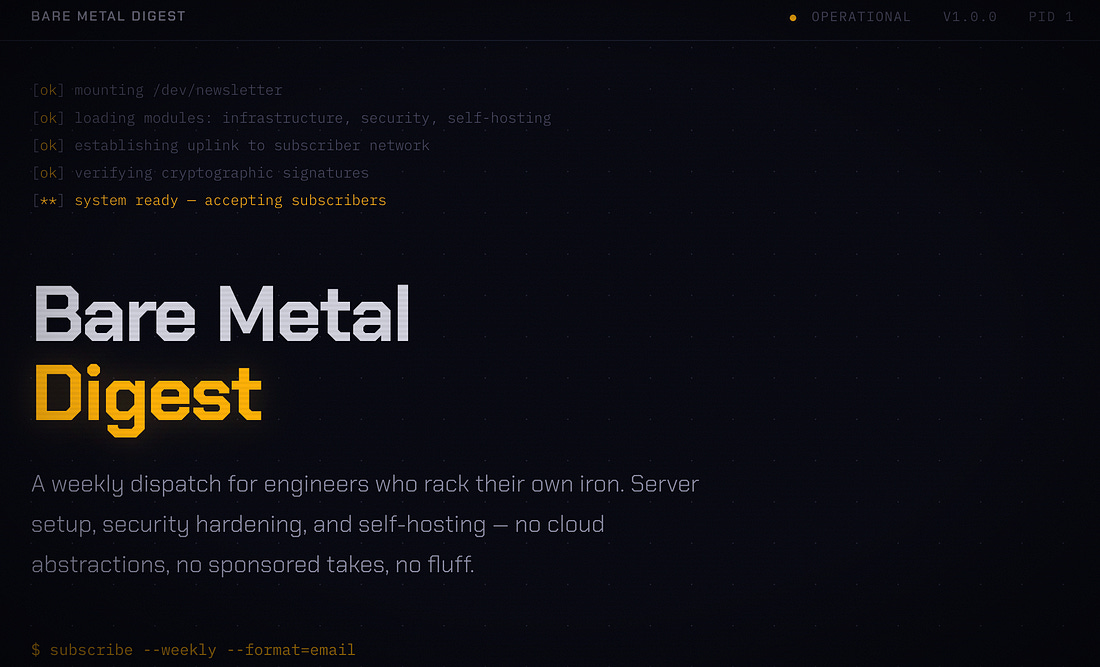
Claude Code with the plugin was the surprise. It didn't just match the web version — it made a bolder design choice than either of the other two. It switched the entire colour palette from the expected terminal green to amber. Paired Chakra Petch with IBM Plex Mono. Added a dot-grid background pattern, a horizontal scan-line animation drifting across the hero, and corner bracket decorations on the signup box. The feature cards have an animated amber left-border that scales in on hover. Left-aligned hero instead of centred — more editorial, more intentional.
It was the most cohesive of the three.
What this actually means
The gap between Claude web and Claude Code isn't about capability. It's about instructions. The web version reads a frontend-design skill before generating UI — a set of principles that push it away from "distributional convergence" (Anthropic's term for the tendency of LLMs to gravitate toward the median of their training data: Inter fonts, purple gradients, safe layouts).
Claude Code, working raw in your terminal, doesn't have those instructions by default. It's optimising for building things that work, not things that look good. Which is the right default for an engineering tool — but it means your first UI attempt will look like a first draft.
The plugin levels it up. And because Claude Code also has CLAUDE.md — a persistent context file that shapes every interaction — you can go further than the web version ever could. Your colour palette, your spacing philosophy, your "no generic AI aesthetics" rule, carried forward across every file in the project.
The web version gives you a better first impression. Claude Code gives you a better tenth impression, because it's learned your taste.
The thirty-second fix
Type /plugin in Claude Code and select frontend-design from the marketplace:
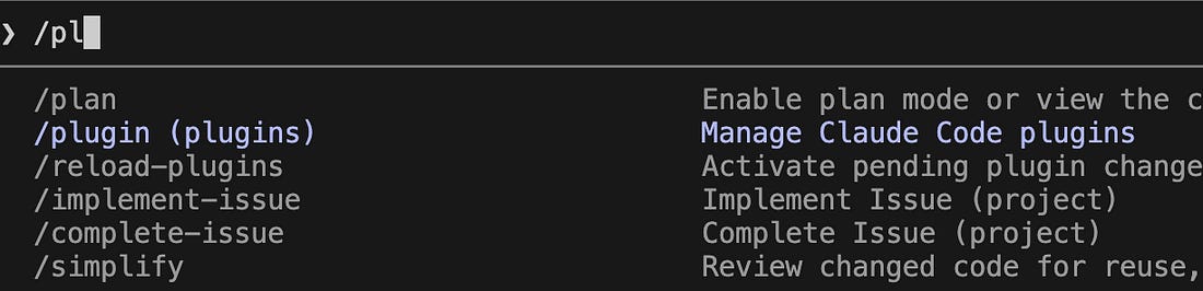
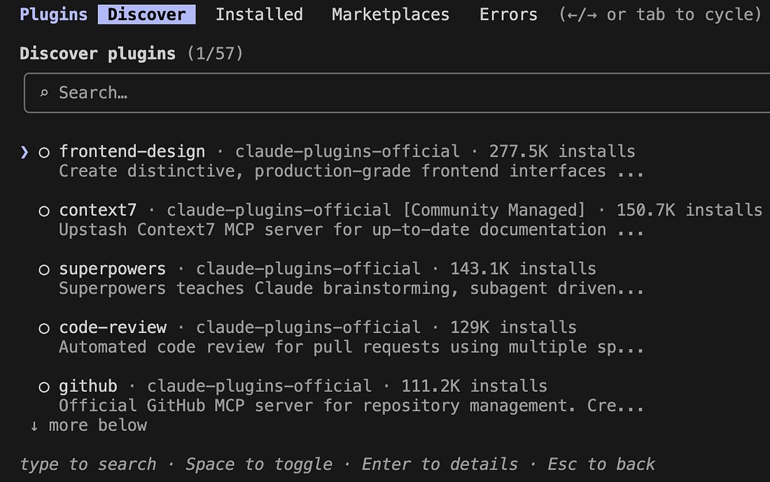
That's it. Next time you ask Claude Code to build UI, it'll read the frontend-design skill first — the same one that powers Claude web's design output.
The design gap is real. But it's not a limitation — it's a configuration you haven't set yet.